AI-assisted reports for an agentic QA platform
How we shaped the reporting experience for BearQ in a single week — concepted in Figma Make, tested with customers, and shipped
Goal
Give users one place to see what BearQ's agents found after an autonomous exploration run — whether anything in their app is broken — and enough evidence underneath that answer to trust a machine's judgement.
Challenge
BearQ was pre-Beta and reports were the feature we would put in front of potential customers. Everything else the platform did happened out of sight: agents explore an application on their own, decide what to try, and surface what they think is wrong. The report is where all of that becomes visible — and it was the moment a user would decide whether the product was worth trusting.
That created a surface with two opposite jobs. Users needed a verdict at a glance — is anything broken, right now. They also needed to dig deeper for context and proof, because a machine telling you your app is fine is only as good as the evidence behind it. One screen had to do both without collapsing into either a number with no substance or a wall of findings.
The timeline was the hard constraint. Knowing how little room a week leaves for exploration, I proposed we build the first concepts in Figma Make rather than static frames — so we would be reviewing something closer to a working report instead of a picture of one.
My role
I led the work and set the direction, working alongside two other designers and mostly with PMs — the product was pre-Beta, so engineering was still forming around it:
- Set the direction for reports and the structure that everything else hung off
- Made the Figma Make call — the decision that made a one-week concept realistic
- Ran the testing with potential customers and translated what came back into changes
- Led and coordinated two designers, who iterated on UI alternatives inside the structure
The solution
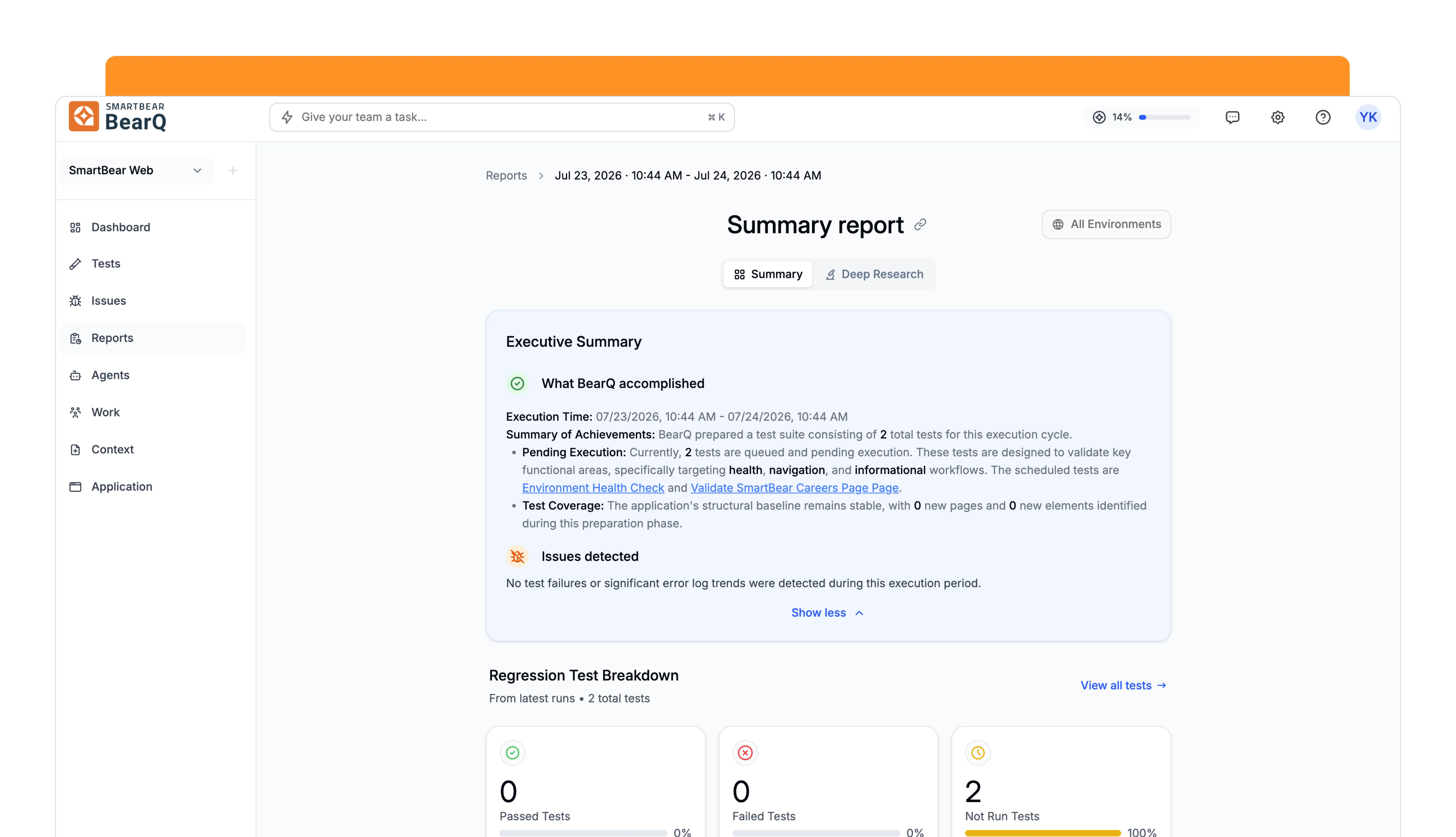
The answer to the two-jobs problem was to stop treating them as one job. The report splits into two tabs: Summary for the verdict, Deep Research for the evidence. A user checking in between runs never has to leave the first tab; a user chasing a failure has somewhere to go that isn't a longer version of the same page.
- An executive summary, in plain languageWhat the agents accomplished this cycle, the execution window, what they prepared and queued, and what coverage they added — written as prose rather than metrics, so the first thing a user reads is an account of the work, not a dashboard.
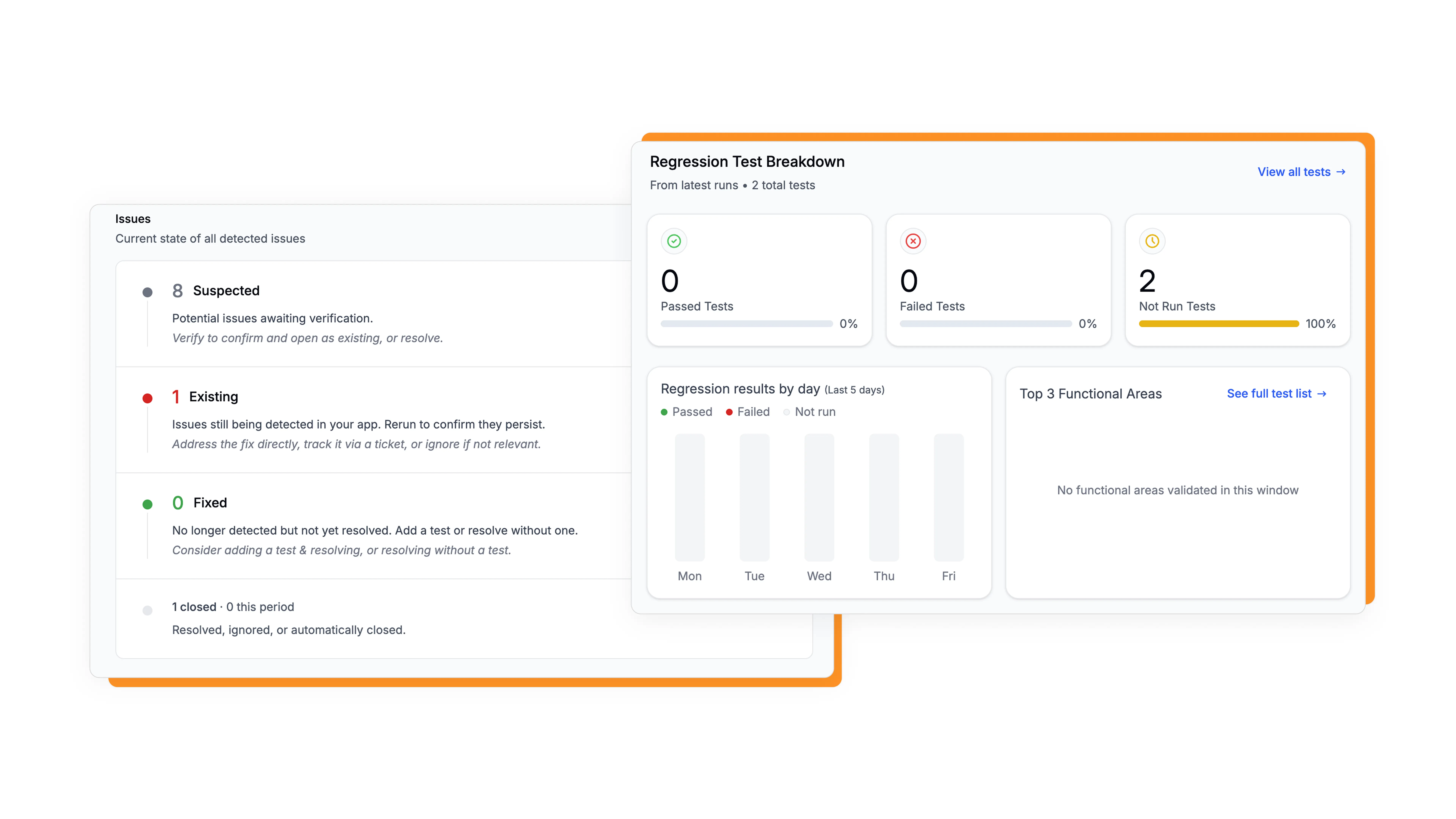
- The regression breakdownPassed, failed, and not-run tests as three parallel counts, with results by day and the functional areas most exercised. The not-run count matters as much as the failures: it's what stops “no failures” from reading as “everything is fine”.
- Issues by state, not just by countSuspected, existing, and fixed — each with what the state means and what to do about it. Suspected issues await verification; existing ones persist and can be fixed, ticketed, or ignored; fixed ones are no longer detected but not yet resolved.
- Deep Research for the evidenceFailures by functional area, regression stability across recent runs to separate flaky tests from genuinely broken ones, and console and network diagnostics — the proof layer for anyone who needs to see why the agent concluded what it did.
A verdict and the evidence behind it are two different jobs. Trying to serve both on one screen serves neither.
What it took — the tradeoffs
The biggest compromise wasn't visual — it was giving up a stage of testing. We had planned to validate on prototypes first. But an AI feature resists that: a report is a container for what agents discovered, and a prototype has nothing in it. Empty states and invented findings tell you whether the layout reads, not whether the product is worth anything. The people we needed feedback from had to see agents actually working to understand what a report was for.
So we cut prototype testing and validated on production instead, once there was real output to react to. That bought honest feedback at the cost of testing later than we would have liked — with less room to change course if the answer had come back badly.
A report with no data doesn't make sense. You can't validate an AI feature on a prototype — users have to see the agents work first.
Outcome
- Shipped, and the structure held. The Summary / Deep Research split is still how BearQ reports work today — the concept from that week survived contact with real users.
- Customer feedback sharpened it rather than replacing it. The clear message was to make reports more action-oriented; we answered it with more drill-downs and an explicit next step on every issue state, not a restructure.
- Figma Make compressed a week into a day. Concept exploration that would normally have taken at least a week produced a first concept in one — which is the only reason a week-long brief was possible at all.
What I'd do differently
I'd skip Figma Make and build the concepts with Claude against a frontend sandbox from the developers — generating the UI from our real front-end components instead of mocked samples and dummy code. Same speed, but the output would be closer to something the team could actually build on, and the fidelity gap between concept and product would close.
It's the same lesson as the testing tradeoff, one level up: design against real material as early as you can. That's now how BearQ is designed day to day — mostly in Claude Code, and only occasionally in Figma.